Recently I went through my old Desmos (https://www.desmos.com/) graphs and I’d like to share 5 of my favorites here. There are some additional interesting graphs at the bottom that are cool as well. You can click on the links after each header to edit and interact with the graphs in the browser.
Complex Plane Rotation
Try it yourself: https://www.desmos.com/calculator/sprwnkggss
The goal of this graph is to take a function $f(x)$ and rotate it around the origin by an arbitrary radian amount in order to demonstrate the concept of rotation in the complex plane. I accomplished this by first looking to rotations in the complex plane, then translating the method to the real plane.
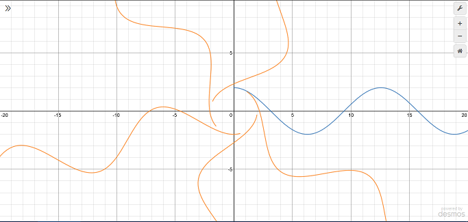
A complex number $z=x+yi$ is plotted in the complex plane by putting the real part $x$ on the horizontal axis and the imaginary part $y$ on the vertical axis. Note that this means each “point” is really just a single number. This means a $z$ can be rotated about the origin $a$ radians by multiplying by $i^{\frac{2a}{\pi}}$. For example, consider $z=1+0i=1$. If you let $a=\pi /2$, the factor becomes $i$, which corresponds to a ninety degree rotation. If you let $a=\pi$, the factor becomes, $i^{2}=-1$, which corresponds to a 180 degree rotation. Complex numbers can also be represented in polar form by $z=r\cos{\left(\theta\right)}+r\sin{\left(\theta\right)}i$, where $r=\sqrt{x^2+y^2}$ (the magnitude of the vector $x\hat{\imath}+y\hat{\jmath}$) and $\theta$ is the angle of the same vector with the positive x axis.
Unfortunately, Desmos does not support complex numbers. Luckily, the parameterization of the complex unit circle is exactly the same as the parameterization of the unit circle in the real plane (excluding the imaginary unit of course). In the Desmos graph I took advantage of this fact to rotate each point. To rotate an entire curve (as opposed to a single point), I made a parametric function of $t$ and applied the transformation to each point $(t, f(t))$ in the domain $a\leq t \leq b$.
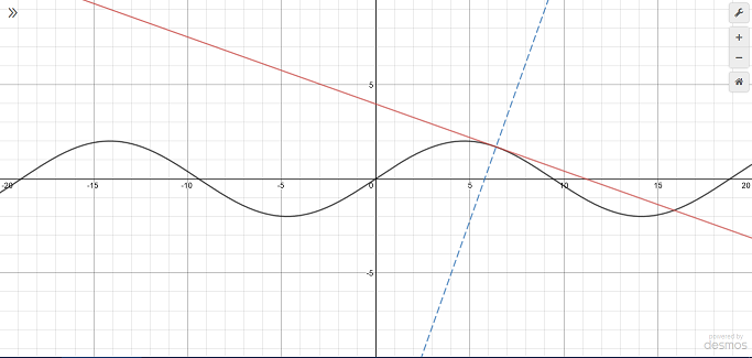
Tangent and normal lines
Try it yourself: https://www.desmos.com/calculator/mpvmkh7rjm
I like this one because of the simplicity. I also like it because I had no idea how to do calculus when I created it about a year and a half ago. However, I did understand that the derivative magically yields the slope of the function at any given point. So I decided to create a little demonstration, and this is probably one of the first things that got me seriously interested in math.
Generalized ellipse functions
Try it yourself: https://www.desmos.com/calculator/p0bdbz3enr
This graph shows the functions that yield the $x$ and $y$ coordinates of a point as it moves around an ellipse. This is analogous to the $\sin$ and $\cos$ functions for a circle. In fact, if you set $a=c_0$ and $b=c_0$ in the graph above for some $c_0\neq 0$, the resulting functions will be the sine and cosine.
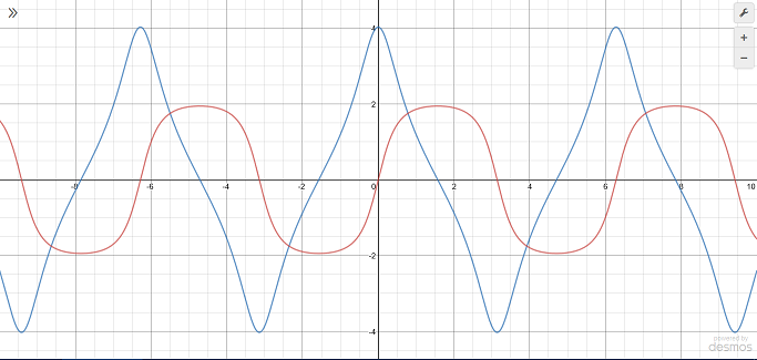
I don’t know of any applications for this, but it is pretty interesting to see how the shape of these functions change depending on the characteristics of the ellipse. For example, from the image above, you can tell the major axis is in the $x$ direction because the cosine analog has a greater range than the sine analog. The top and bottom of the blue curve are pinched together because the direction of the point moving along the circle is rapidly changing since the ellipse is wider than it is tall.
Blob
Try it yourself: https://www.desmos.com/calculator/eftx3nenl7
Although it has no purpose, this is still one of my favorites. Basically, you can select 1 of 2 blob types. Both blobs follow the given function $f(x)$ as $c$ changes. Press the play button on the $c$ slider or simply move it back and forth manually to see the blob move. The difference between the two blobs is the nature of their shapes. The second blob (“not so blobby blob”) is easier to explain, so I’ll start with that. The general form of a circle centered at $(a, b)$ with radius $r$ is
$$(x-a)^{2}+(y-b)^{2}=r^{2}$$.
I wanted the blob to move along the $x$ axis as $c$ varies so I set $a=c$. The blob has to follow the function, though, so I set $b=f(x)$. Note that $f(x)$ is a function of $x$, so chances are it isn’t a constant. When it is, the blob is just a circle. Otherwise, the blob is a sort of ellipsoid shape that points in the direction of the function. Still, this doesn’t feel blobby enough. So began the first blob type (“blobby blob”). I wanted to give the blob an expanding and contracting motion, sort of like a jellyfish. Luckily, math gives us the perfect tool for this: sinusoidal functions. I added in $\cos(x)$ to the $x$ coordinate to create the jellyfish effect and it works pretty well. You can make the blob more interesting by composing and summing additional sinusoids, but it slows down the blob due to greater computation time, which ruins the effect.
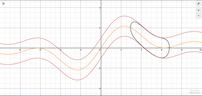
Contour Plotter
Try it yourself: https://www.desmos.com/calculator/cybnqgn4w5

Recently in my math class we went over “contour plots” which show the curves of intersection between a function $f(x,y)$ and a number of constant planes of the form $z=c$. In other words, they show all the points $(x,y)$ such that $f(x,y)=c$. The graphs of functions of two variables are surfaces in three dimensions where the entire $xy$-plane (or a subset of it) is the domain and the output is a single number $z$ which is plotted on the vertical axis. Although Desmos does not support 3D graphs, they do support functions of multiple variables. This allows me to take $f(x,y)-c=0$ where $c$ is a list to make a contour plot. (If you aren’t familiar with how lists work in Desmos, visit https://support.desmos.com/hc/en-us/articles/204990855-Lists).
Additional Graphs
- My attempt at implementing 3D surfaces on Desmos: https://www.desmos.com/calculator/8cluhywyfm
- Some of the popular Taylor series (I couldn’t make Taylor series for arbitrary functions because Desmos doesn’t have nth derivative support): https://www.desmos.com/calculator/aeoth9ded3
- Parameterization of Squircles: https://www.desmos.com/calculator/qd2zv45tdb
- A graph inspired by a post I saw on the Mathematica stack exchange about styling plots to make them look like xkcd comics (the plots are supposed to look like they were drawn by hand). I can’t figure out how to make the sloppiness irregular using continuous functions though. https://www.desmos.com/calculator/sac6ofqa2c
- Calculating the intersection points between a circle and line: https://www.desmos.com/calculator/oawsdsf9y1